Surveys & Research

I have personally led >200 research initiatives, enabling strategic decisions that eliminated ~$4M in annual outsourcing costs.
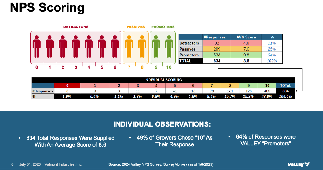
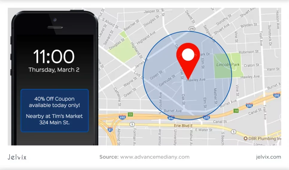
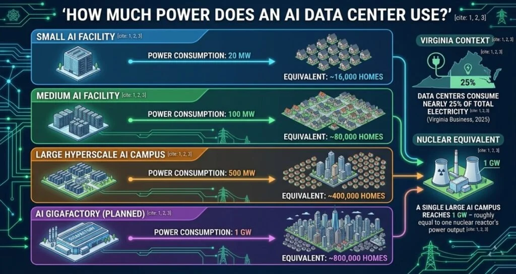
Chart displaying NPS (Net Promoter Score) scoring categorized by Detractors, Passives, and Promoters with counts and percentages. Detractors are marked in pink, Passives in yellow, and Promoters in green. Additional observations highlight responses with an average score of 8.6, most responders are Promoters, and 64% of responses come from valley Promoters.
A smartphone displaying a coupon for 40% off at Tim's Market, located at 324 Main St., with the time 11:00 on Thursday, March 2. The phone screen is beside a map showing a delivery or service radius around a central point near Lincoln Park in a city.
Infographic illustrating the power consumption of various AI data center facilities, comparing small, medium, large hyperscale, and planned gigafactory, with equivalents in homes and nuclear power.
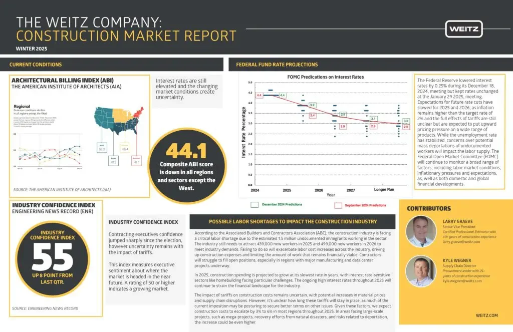
Construction market report cover page with sections on current conditions, Federal fund rate projections, industry confidence index, and contributors. Includes maps, charts, and text highlighting market data and insights.
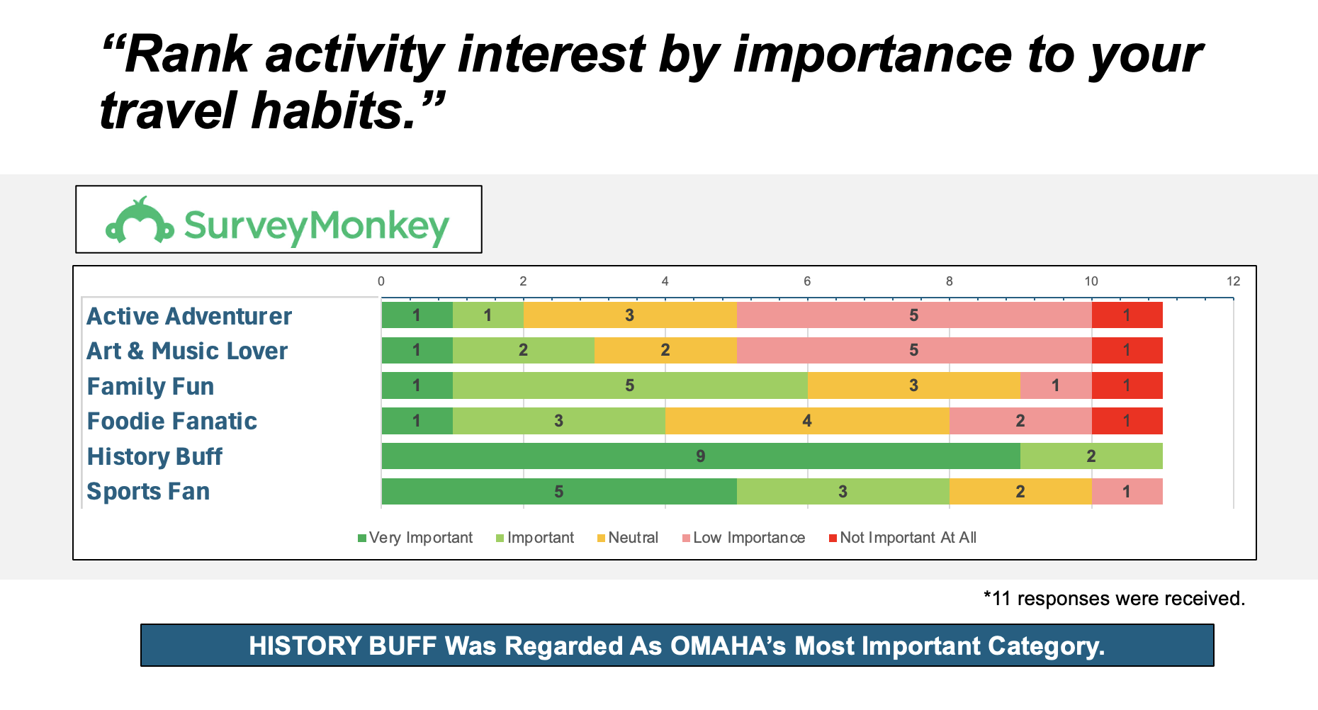
A survey chart showing activity interest ratings by importance for travel habits. Categories include Active Adventurer, Art & Music Lover, Family Fun, Foodie Fanatic, History Buff, and Sports Fan. The chart uses color codes: green for Very Important, light green for Important, yellow for Neutral, pink for Low Importance, and red for Not Important At All.
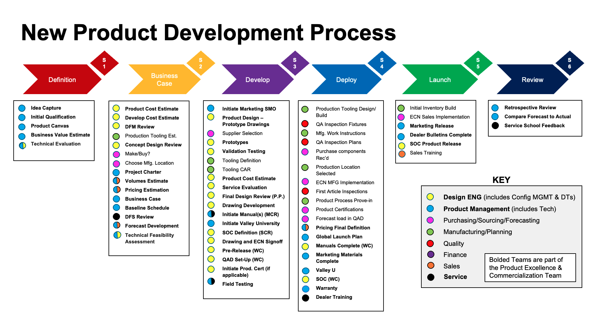
Flowchart illustrating the new product development process with phases: Definition, Business Case, Develop, Deploy, Launch, Review, and key. Each phase contains numbered steps and color-coded tasks, with a legend explaining the symbols and colors indicating different team responsibilities.